By Motor1 Global Automotive Insights
Originally adapted from Motor1 Italy
For decades, the anatomy of a car’s identity was defined by a chrome badge. Whether it was an arrow slicing through the wind, a roaring lion, a sleek lightning bolt, or a classic oval, a single, highly stylized emblem was all a vehicle needed to announce its provenance. These metallic crests were status symbols, heritage markers, and instant identifiers rolled into one.
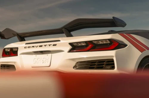
Today, however, a quiet revolution is taking place across global automotive design studios. More and more manufacturers are choosing to completely spell out their full corporate names across the sheet metal.
What might initially appear to be a minor styling fad or a passing graphic trend is actually a profound shift in modern vehicle architecture. Lettering is no longer just an afterthought or a marketing sticker; it has become a structural design element. It defines the muscular sweep of the rear fascia, anchors the geometry of modern lighting signatures, and establishes an integral component of both physical vehicle design and digital brand communication.
Main Facts: The Evolution From Symbol to Script
The transition from isolated icon to expansive typography represents one of the most intriguing shifts in automotive styling over the past decade. While heritage brands like Porsche and Volvo have famously utilized rear-end lettering for generations—the iconic spaced-out "P-O-R-S-C-H-E" script on the 911 being a prime example—the practice has now broken containment, becoming a widespread industry standard.
Modern vehicles are increasingly adopting full-width brand names on both the rear liftgate and, in many cases, integrated directly into the front fascia.
- The Skoda Elroq Example: In Europe, the all-electric Skoda Elroq showcases this philosophy perfectly. The traditional winged-arrow emblem has been entirely excised from the vehicle’s nose and tail, replaced instead by clean, individual lettering. This script serves as a cornerstone of Skoda’s "Modern Solid" design language, acting as a structural anchor for the front and rear geometry.
- The Geometry of Typography: Unlike a small, central badge that draws the eye to a single point, a spelled-out wordmark introduces horizontal rhythm. It interacts directly with design lines, spans across sheet metal creases, and bridges the gap between modern LED light bars.
- Stylistic Diversity: Brands like Lancia and DS Automobiles harness this trend through completely different artistic lenses. While Lancia leans into its storied, theatrical heritage with bespoke serif and sans-serif variations, DS opts for a Parisian, avant-garde minimalist approach. The underlying philosophy remains identical: the brand name is woven into the vehicle’s visual composition rather than slapped onto it.
Chronology: How the Chrome Badge Lost Its Monopoly
To understand how we arrived at the era of the automotive wordmark, it is necessary to examine how exterior branding has evolved alongside manufacturing techniques and design philosophies.
The Mid-20th Century: The Golden Age of Emblems
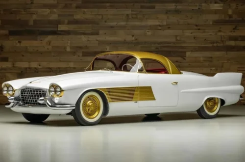
In the mid-to-late 20th century, badging was a craft. Enamels, heavy chrome platings, and die-cast zinc ornaments were standard. Brands vied for distinction through increasingly elaborate hood ornaments and grille crests. The badge was a standalone piece of jewelry adorning the machine.
The Late 20th Century: Aerodynamics and Weight Reduction
As fuel economy regulations tightened and wind tunnels dictated vehicle shapes in the 1980s and 1990s, protruding hood ornaments largely vanished for safety and aerodynamic reasons. Badges flattened, migrating flush onto grilles and trunk lids. However, the reliance on the isolated logo remained absolute.
The 2010s: The Rise of the Retro-Modern Revival
Pioneered largely by luxury and performance brands wanting to evoke a sense of heritage, companies like Porsche began resurrecting rear-end lettering. This was initially seen as a nostalgic nod to air-cooled classics and vintage rally cars. Soon, startup luxury brands and mainstream manufacturers realized that spelling out the name projected a sense of upmarket confidence and global legibility.
The 2020s and Beyond: The Electric and Global Era
Today, the acceleration of this trend is directly tied to two major industry forces: the transition to electric vehicles (EVs) and the explosion of the global automotive market—particularly the influx of new Asian manufacturers. With EVs demanding cleaner, aerodynamically optimized surfaces, and global markets requiring instant cross-cultural brand recognition, the spelled-out wordmark has emerged as the ultimate visual tool.
Supporting Data and Technical Integration: Typography as Architecture
Spelling out a brand name on a car is not merely a graphic design exercise; it is an engineering challenge. Modern automotive designers treat typography with the exact same level of meticulousness traditionally reserved for wheel spokes, headlight arrays, and body panel stampings.
[Traditional Era]  -->  Logo placed centrally as an isolated ornament
[Transition Era]   -->  Heritage lettering revived for nostalgic/premium appeal
[Modern EV Era]    -->  Typography integrated into lighting bars, aerodynamics, and structural sheet metal
The Illumination Revolution
Consider the approach taken by Peugeot. Rather than simply applying chrome or matte-black letters to a painted trunk lid, Peugeot integrates its brand name directly into the rear light bar. On certain models, the lettering is illuminated, turning the typography into a functional light source that acts in concert with the taillights.
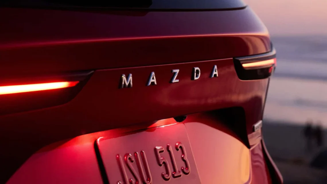
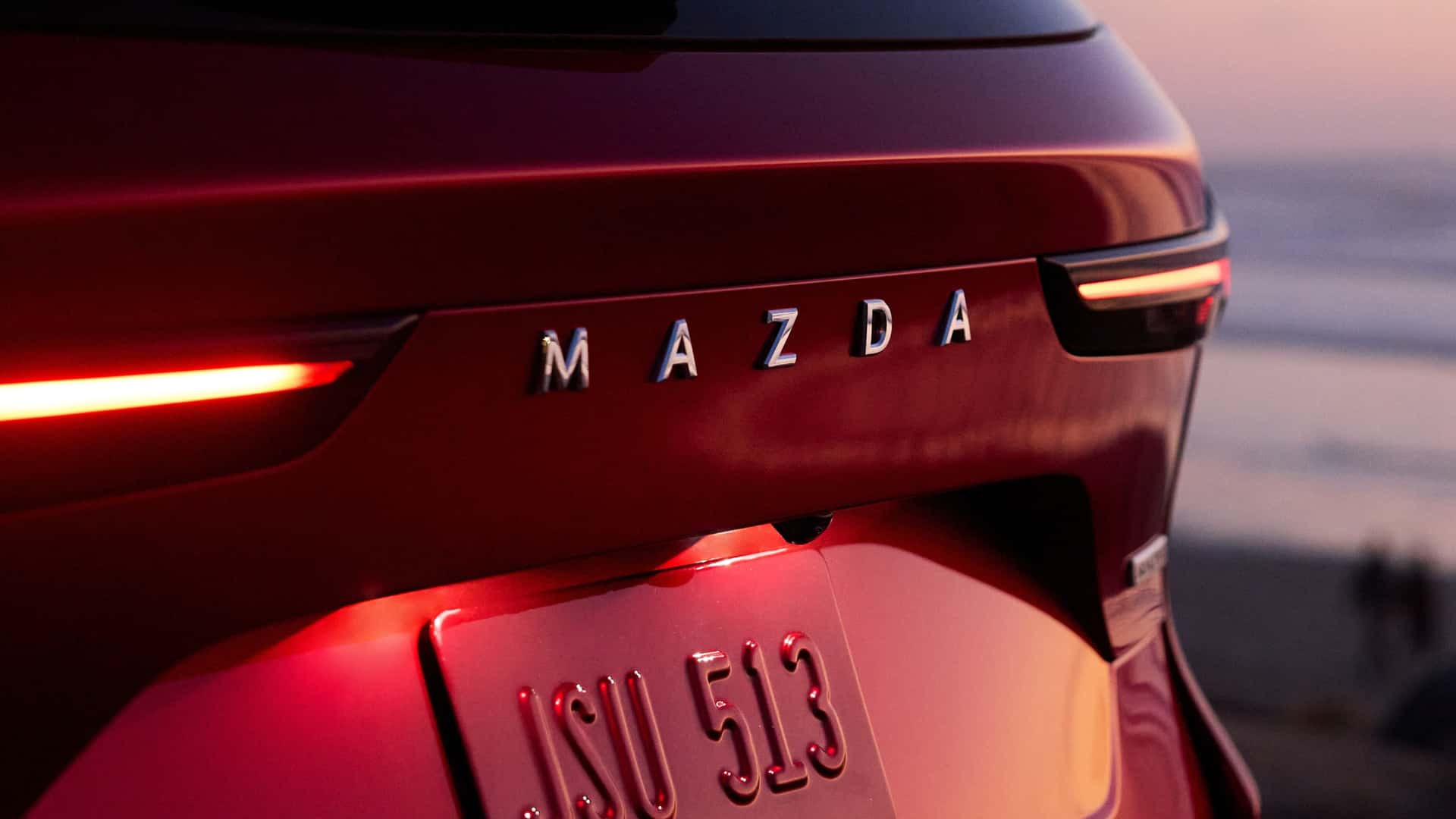
Similarly, brands like Mazda utilize minimalist, cleanly spaced lettering that complements the subtle, fluid surfacing of their Kodo design philosophy. The letters do not scream for attention; instead, they harmonize with the vehicle’s shoulder lines and negative space.
The Death of Clutter
Modern automotive design is trending heavily toward reductionism. Designers are actively purging unnecessary lines, fake air vents, and visual clutter. In a world of ultra-clean surfaces, a traditional badge can sometimes look isolated, dated, or visually disruptive. A carefully proportioned wordmark, conversely, can distribute visual weight evenly across the rear of the car, balancing the expansive width of modern vehicle platforms.
Official Responses and Industry Perspectives
Design directors and brand strategists across the automotive landscape have increasingly spoken out about this subtle yet profound metamorphosis in exterior aesthetics.
According to design leads at Volkswagen Group and Stellantis, the shift toward spelled-out lettering is heavily driven by digital consumption habits. In an age where cars are primarily discovered via smartphones, social media feeds, and digital configurators, clarity is paramount.
"When a vehicle is scaled down to a thumbnail on an Instagram feed or a car-buying app, intricate, small-scale chrome badges often blur into an unrecognizable smudge," notes an exterior lighting and branding specialist within the European automotive sector. "A clean, well-spaced typography wordmark maintains legibility across any screen size, while instantly communicating identity in physical space."
Furthermore, industry insiders point out that as new markets open up and vehicle designs become more homogenized due to safety regulations and aerodynamic constraints, the brand name serves as a vital differentiator. When every crossover starts to share a similar silhouette, the way a company spells its name across the tailgate can be the defining factor that sets it apart from the competition.
Implications: What the Wordmark Means for the Future of Car Design
The ubiquity of automotive lettering carries broad implications for the future of vehicle styling, manufacturing, and consumer psychology.
1. The Global Recognition Factor
With the rapid globalization of the car market—marked by the entry of numerous new Chinese and Asian automakers onto the global stage—instant brand recognition is more critical than ever. A complex emblem requires consumers to learn a new symbol; a clear, readable wordmark instantly communicates who made the vehicle, breaking down language and cultural barriers in international markets.
2. The Persistence of the Heritage Crest
Despite the dominance of lettering, traditional badges are unlikely to vanish entirely. Companies recognize that historical emblems hold immense emotional and cultural equity. Consequently, many manufacturers are adopting a dual approach: retaining the iconic crest on the hood or steering wheel as a nod to tradition, while utilizing the bold, spelled-out wordmark across the rear or front light arrays to project modernity.
3. The New Aesthetic Baseline
Ultimately, the shift from symbol to script signals a maturation in how cars communicate. As surfaces grow cleaner and technology becomes more integrated, every single exterior component must work harder to justify its existence. The badge is no longer just a metal stamp; it is an architectural signature.
As we look toward the next generation of mobility, the humble wordmark proves that sometimes, the most powerful statement a car can make is simply spelling out who it is.