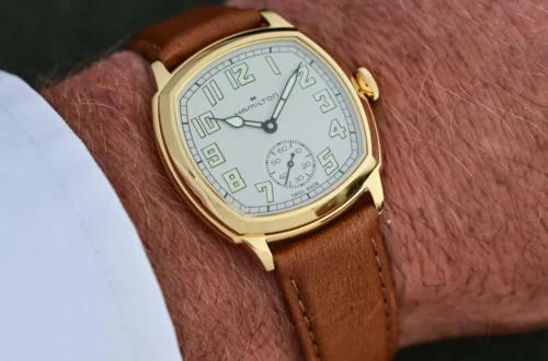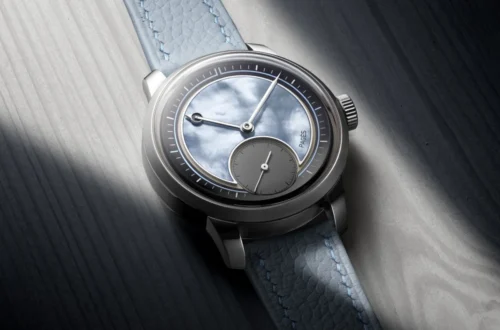
Following explorations into dial materials and sector layouts, our ongoing "ABCs of Time" series shifts focus to the architectural identity of the wristwatch: the dial style. While timepieces fundamentally serve a singular utilitarian purpose—tracking the passing hours, minutes, and seconds—their typographic arrangements, structural depths, and graphic motifs echo the defining design movements of human history. From the theatrical ornamentation of the Renaissance to the austere functionality of Bauhaus and military applications, dial styles serve as visual markers of societal evolution.
Main Facts: The Anatomy and Philosophy of the Watch Dial
At its core, a watch dial is an interface—a canvas bridging mechanical engineering and human perception. While cars reflect aerodynamic trends across decades, watch dials mirror prevailing artistic paradigms, geopolitical conflicts, and technological leaps.
- Form vs. Function: Early timepieces prioritized status, theatrics, and ornamentation. Conversely, modern and military watches elevate legibility, employing minimalist layouts inspired by the German Bauhaus movement or strict operational protocols.
- The Common Thread: Despite vast differences in aesthetic approach—whether using printed or applied indices, Roman or Arabic numerals—historic dial styles encapsulate the zeitgeist of their respective eras, immortalizing milestones in horological history.
Chronology: The Historical Evolution of Dial Styles
The Early Years: Nuremberg Eggs and Theatrical Ornamentation
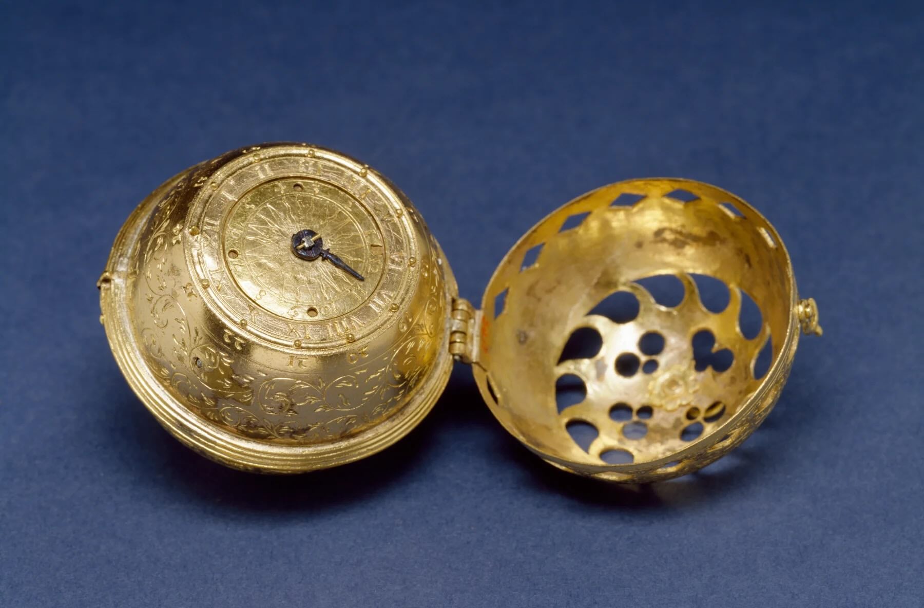
In the earliest days of portable mechanical timekeeping—epitomized by the spring-driven "Nuremberg eggs" crafted by German locksmith Peter Henlein in the 16th century—accuracy was a secondary concern. These marvels were often so imprecise that they featured only a single hour hand; adding a minute hand would have been redundant when deviations measured hours per day.
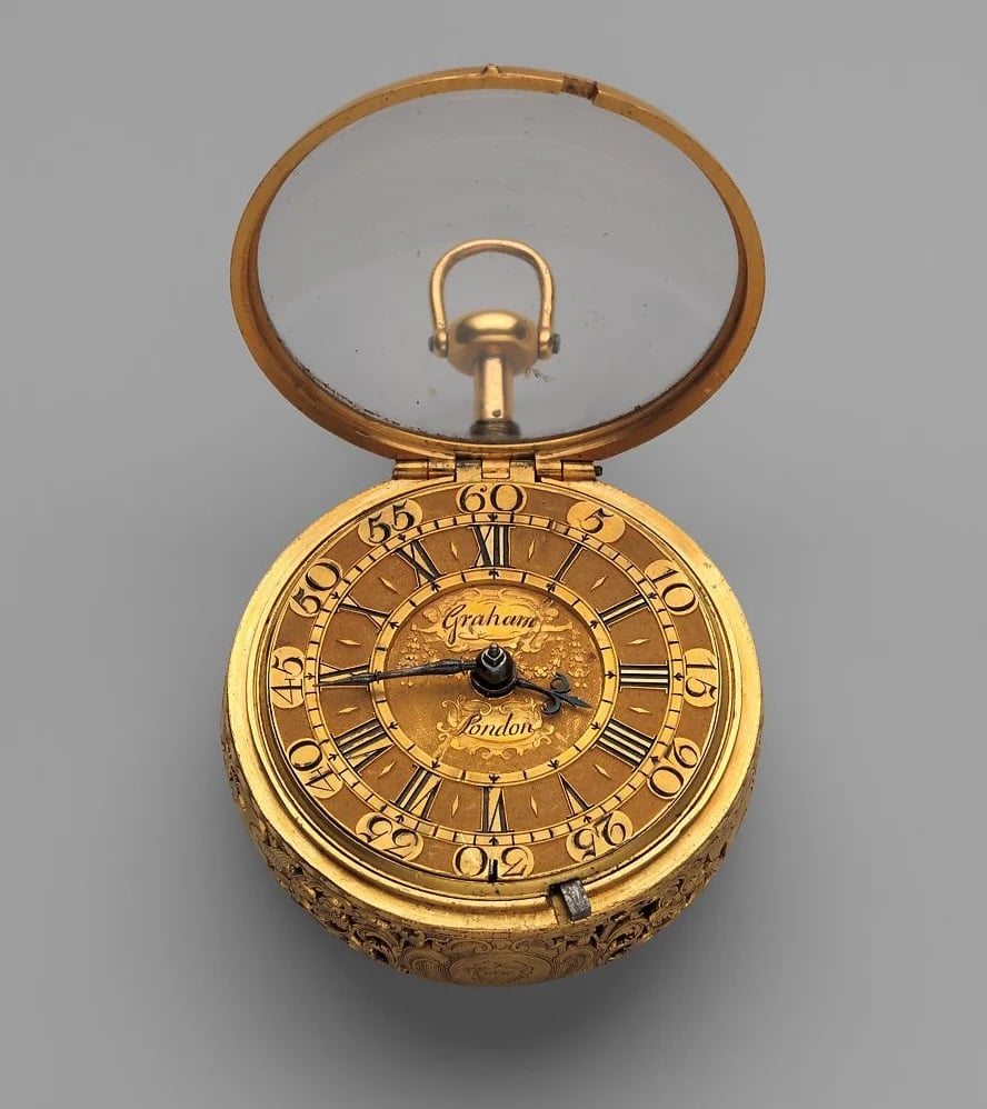
Lacking protective watch crystals, these early portable devices used hinged metal lids. Straightforward, utilitarian dials featuring engraved markings and Roman numerals quickly yielded to elaborate works of fine art. Because watches were among the most expensive possessions a person could own—often surpassing the cost of land and housing—elaborate case and dial designs catered to wealthy elites and royalty.
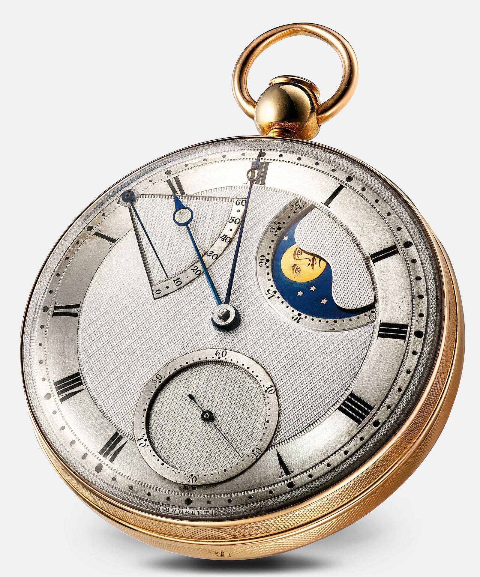
Dials doubled as horological theater:

- Horological Braille: Raised metal pins positioned next to hour markers allowed users to "feel" the time in the dark, with a longer pin orienting the 12 o’clock position.
- Vitreous Enamel: Introduced experimentally in the 16th century to render vibrant, multi-colored scenes.
- Astronomical Complications: As precision mechanics improved, tiered rotating discs emerged to display moon phases and zodiac signs.
Mechanical Breakthroughs: The Huygens Revolution
The late 17th century introduced unprecedented mechanical precision. Dutch polymath Christiaan Huygens invented the pendulum (1656) and the balance spring (1675). The pendulum slashed daily clock errors from 15 minutes down to roughly 10 seconds, introducing the mainstream seconds hand.
When applied to watches, the balance spring stabilized balance wheel oscillation and isochronism, improving accuracy from hours down to minutes per day. Watch dials evolved in tandem, abandoning excessive ornamentation for a no-nonsense, functional approach. Clear hour indicators paired with detailed minute and seconds tracks transformed timepieces into serious navigational and professional tools.
The Lépiné Aesthetic and Enlightenment Elegance
During the Baroque era (approx. 1600–1750), master watchmaker Jean-Antoine Lépiné revolutionized watch architecture in 1764 by introducing independent bridges and moving the balance wheel to the gear train’s plane. By eliminating the bulky fusee-and-chain mechanism, he achieved significantly thinner movements and flatter cases.
To match this modern architectural profile, Lépiné pioneered the Lépiné Aesthetic:
- Thin Arabic numerals replaced heavy Roman numerals.
- Dotted minute tracks and ample negative space created a clean, symmetric look.
- Open-worked hands with distinctive arrow tips laid the groundwork for future masters, including Abraham-Louis Breguet.
Abraham-Louis Breguet: The Master of Guilloché
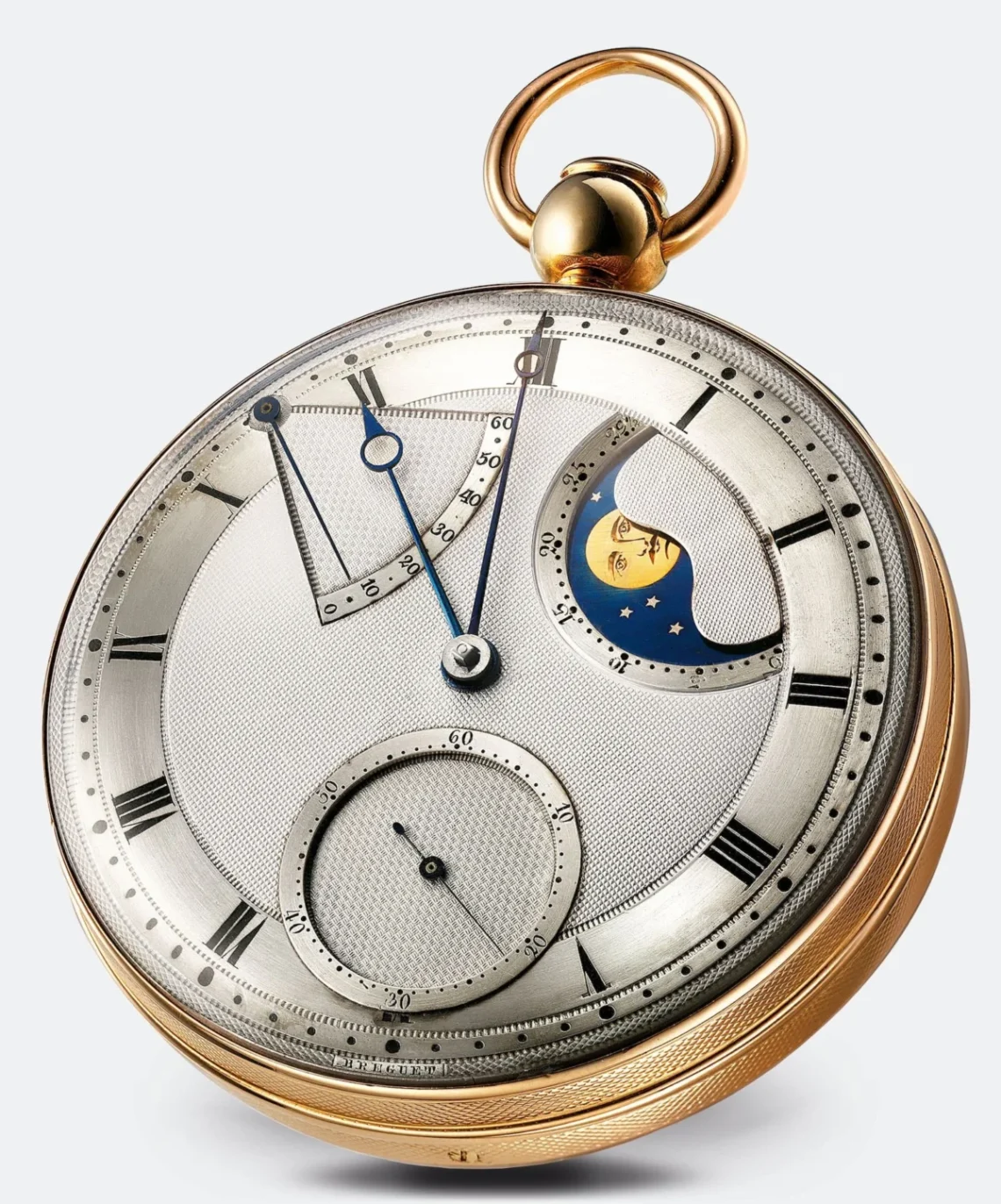
Abraham-Louis Breguet’s contributions to horology are legendary, spanning the tourbillon, the pare-chute shock protection system, and the hairspring overcoil. His dial innovations remain industry standards today:
- Breguet Numerals: Slanted, calligraphic Arabic numbers.
- Breguet Hands: Elegant hands featuring an open eccentric circle near the tip.
- Guilloché: In 1786, Breguet pioneered the use of rose engine lathes to carve intricate geometric patterns directly onto metal dials. This innovation served a dual purpose: it reduced outdoor glare and established clear visual sectors for varying complications.
Supporting Data: Specialized Dials of Industry and Conflict
Railroad Dials: Precision as a Matter of Life and Death
The expansion of railway networks necessitated absolute temporal synchronization. Following the tragic "Kipton Train Collision" in Ohio in 1891—caused by a pocket watch lagging by four minutes—Chief Time Inspector Webb C. Ball established rigorous railway timepiece standards.
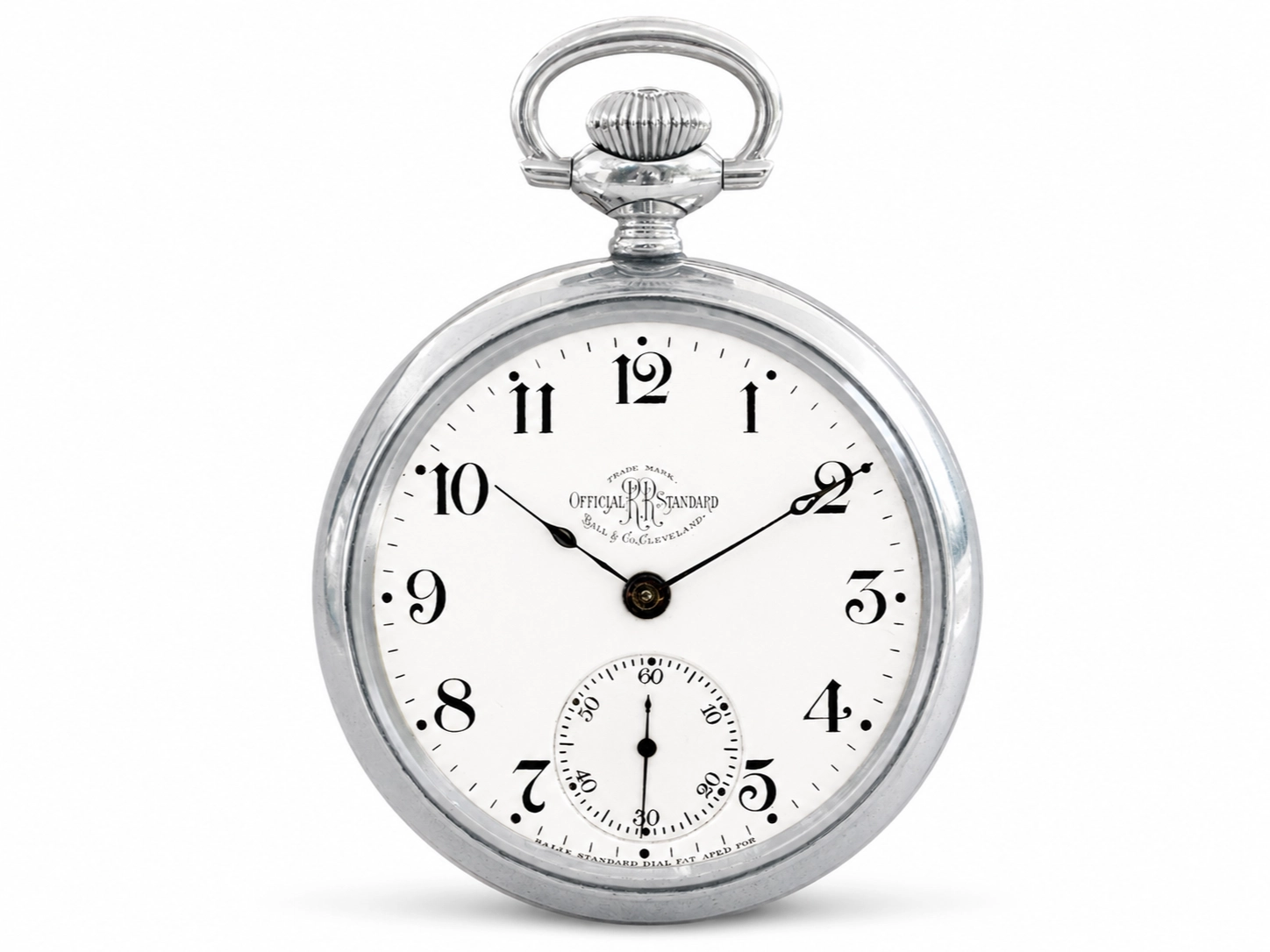
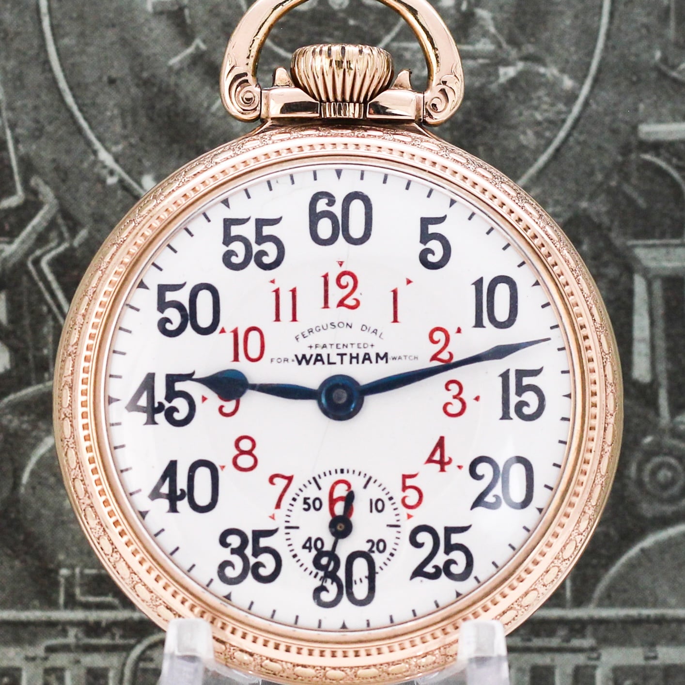
- The Ball Standard: Mandated open-faced pocket watches, white enamel dials, bold black Arabic numerals (Roman numerals were strictly banned), and distinct 5-minute markings (dots, squares, or diamonds). A large subsidiary seconds dial sat at 6 o’clock.
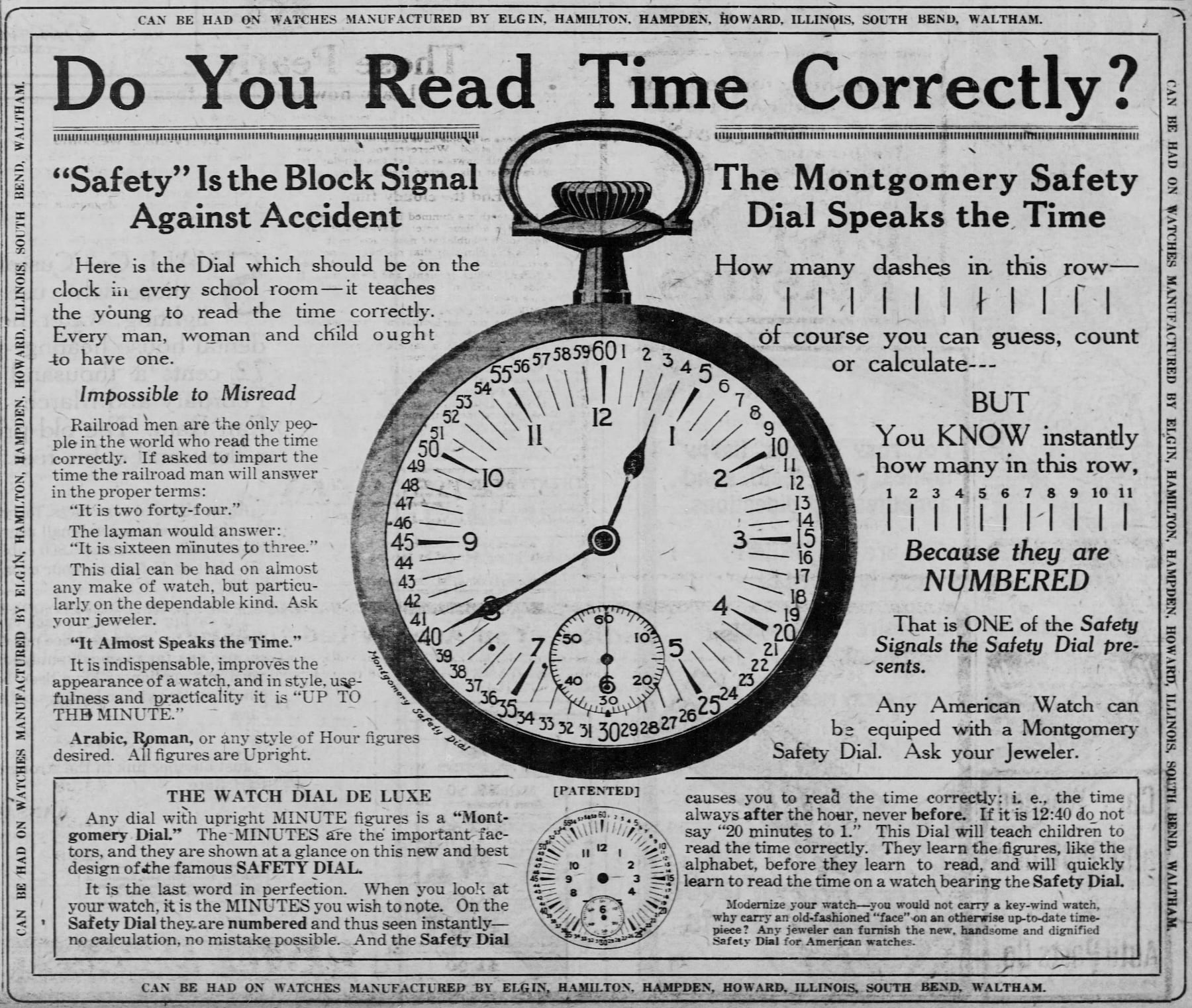
- The Montgomery Safety Dial: Developed by Henry S. Montgomery in 1899, this design featured peripheral minute numbers for every single minute, with every five-minute marker highlighted in red. Adopted widely by major American railways (Santa Fe, Elgin, Hamilton), it ensured infallible reading of fractional minutes.
World War I and the Birth of the Wristwatch
World War I catalyzed the transition from pocket watches to wristwatches ("wristlets"). Military specifications emphasized rapid legibility.

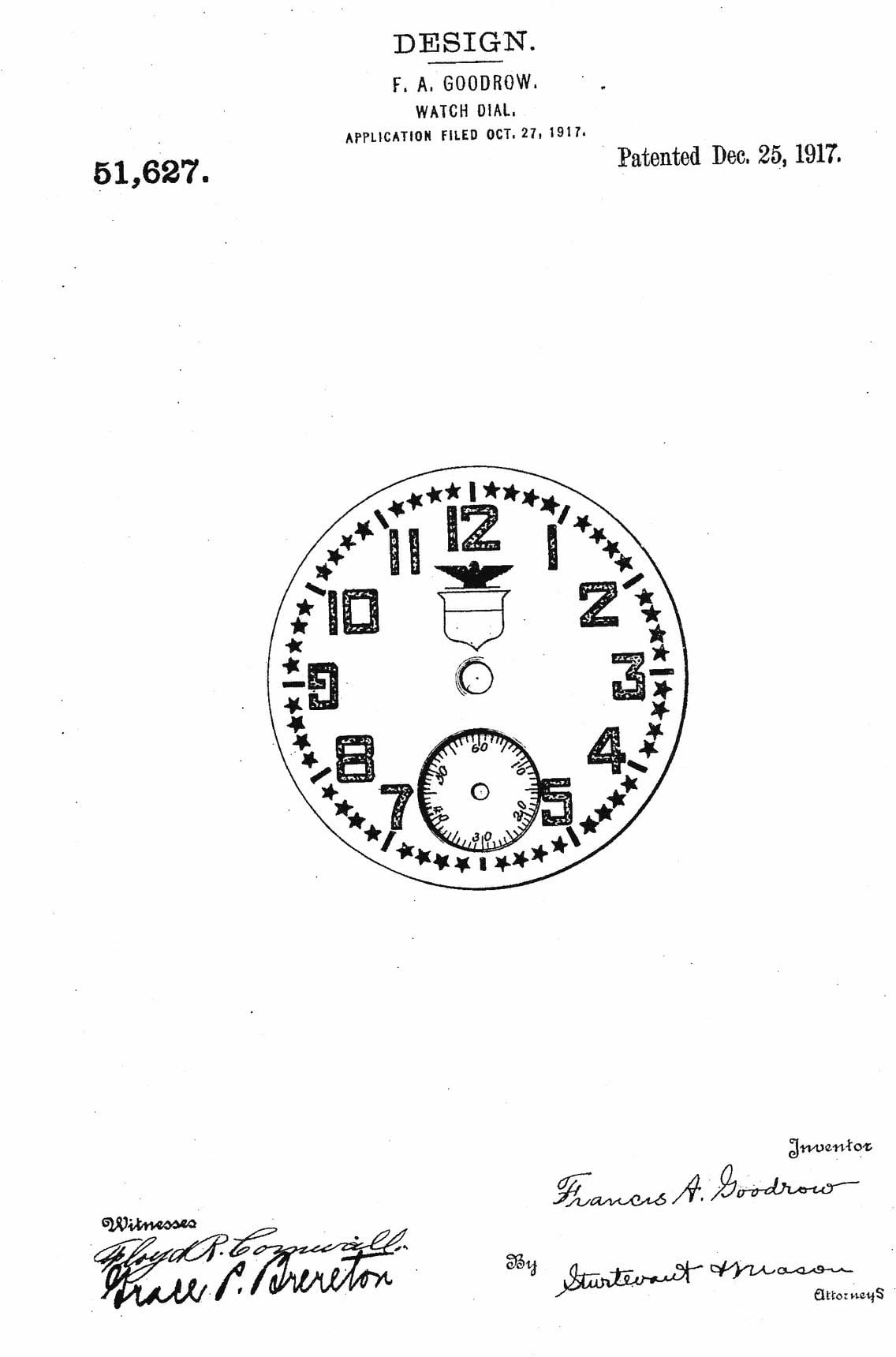
- Elgin Star Dials (1917): Featured oversized Bodoni-style white Arabic numerals over black enamel, perimeter white stars marking minutes, and an eagle insignia above the 12 o’clock mark.
- Officer Trench Dials: Produced by Longines and Omega, these utilized white enamel, bold black Arabic numerals, and protective grill-style hinged covers. Radium-226 paint and prominent red 12 o’clock markers provided immediate orientation.
Interwar Art Deco, Sector, and California Dials
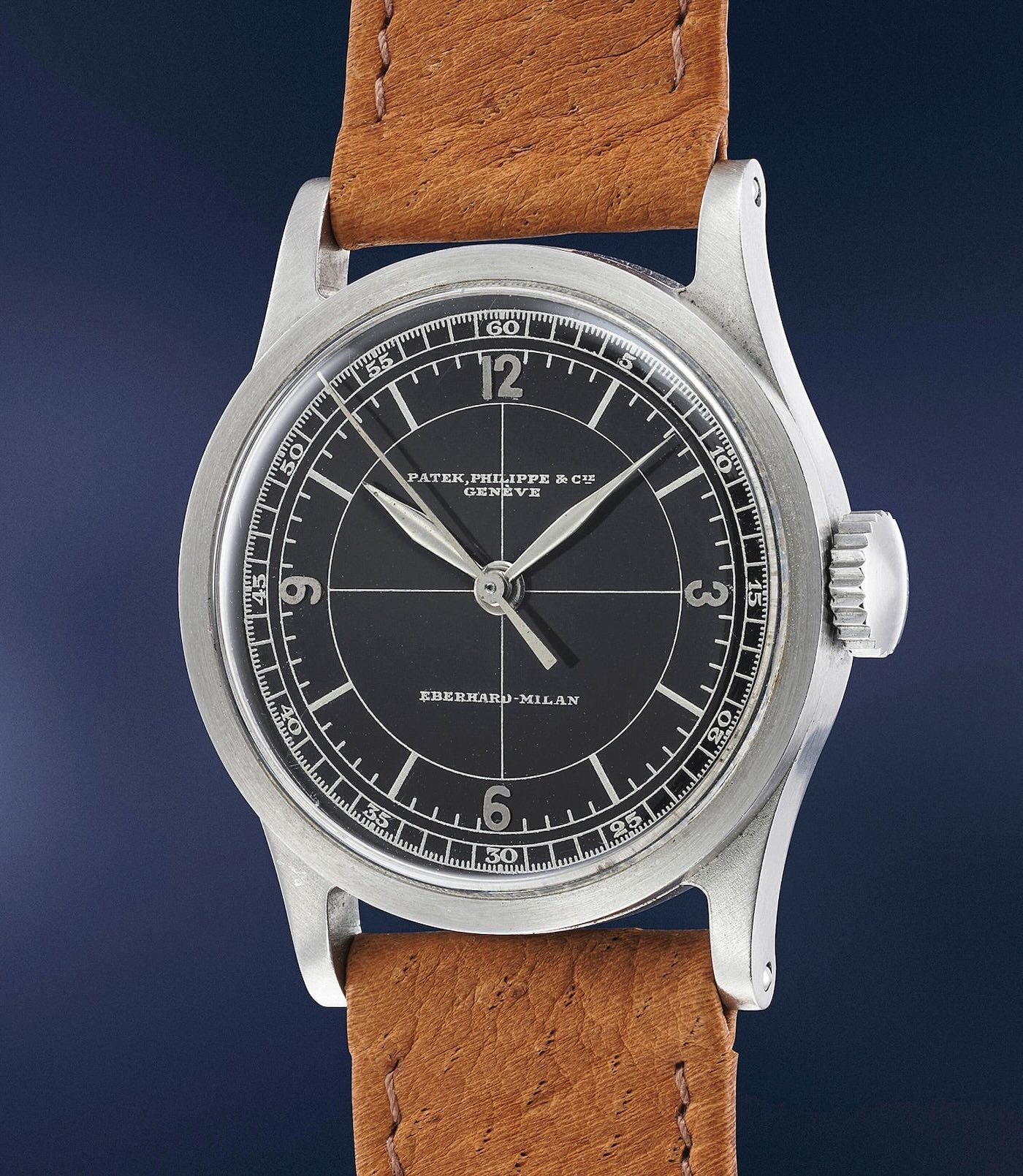
The 1920s redefined wristwatches as masculine fashion statements. The Art Deco movement inspired geometric symmetry, exemplified by Patek Philippe’s introduction of the Sector Dial in 1924. By concentric ring alignment and crosshair patterns, sector dials maximized readability.
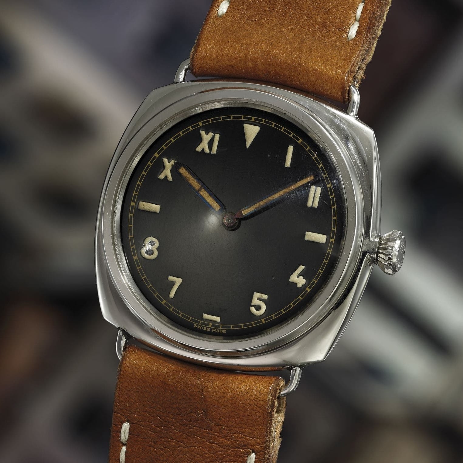
Simultaneously, Rolex patented the California Dial in 1942 (popularized earlier through military partnerships with Panerai for Italian Navy frogmen). This layout split the dial between Roman numerals on the upper half and Arabic numerals on the lower half, with horizontal dashes at 3 and 9 o’clock. Marketed as an "error-proof" design, it prevented underwater disorientation for military divers.
Bauhaus Minimalism and Gilt Dials
Embracing the "form follows function" philosophy, the German Bauhaus movement birthed minimalist typographic layouts. Produced by Weber & Baral in 1937 for A. Lange & Söhne and Stowa, these clean sans-serif dials influenced later icons like the Junghans Max Bill (1961) and the Nomos Tangente (1992). This lineage eventually inspired Nathan George Horwitt’s Museum Dial for Movado in 1960, notable for its sterile face marked only by a single dot at 12 o’clock.
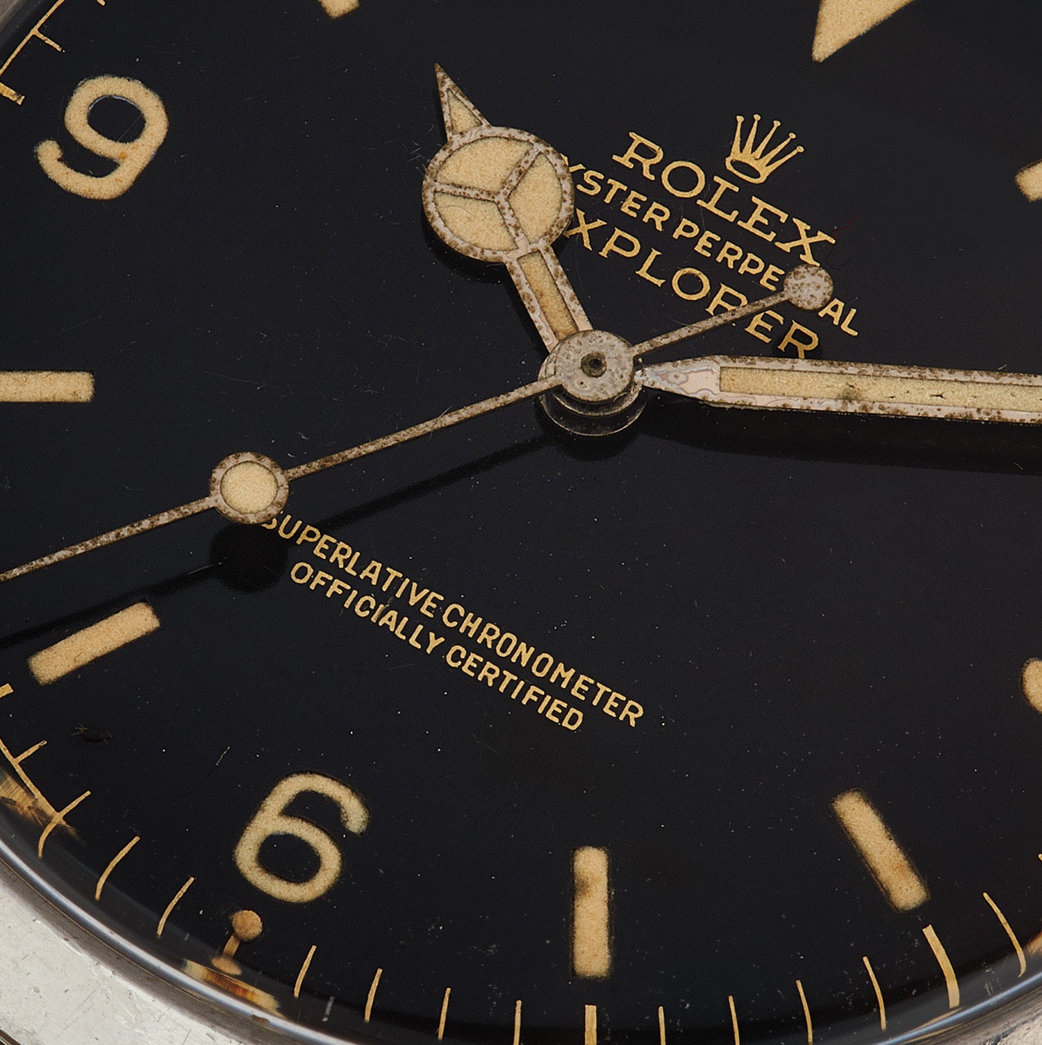
Parallel to this minimalist movement, the 1940s through 1960s heralded the golden age of Gilt Dials. Utilizing a complex chemical and electroplating process, watchmakers applied gold-toned numerals and chapter rings onto mirror-finished brass blanks submerged in galvanic black baths. Found on legendary references like the Rolex Submariner (5512/5513) and Explorer (1016), true gilt dials possessed a multi-dimensional warmth that modern pad-printing struggles to replicate.
World War II: The A-11, Dirty Dozen, and B-Uhren
Military necessity during WWII standardized some of history’s most iconic dials:
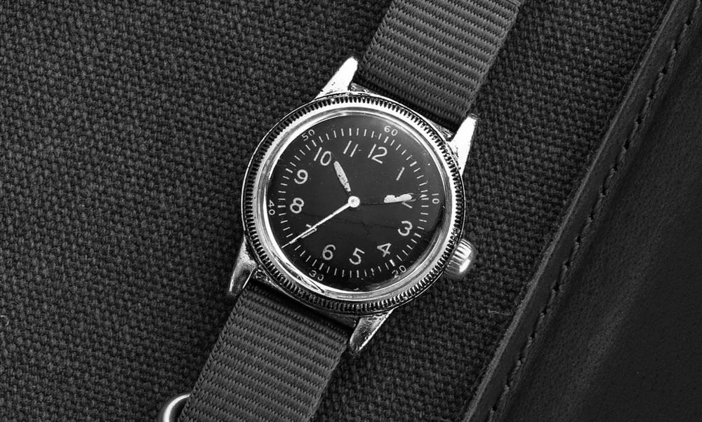
- The A-11 ("The Watch That Won the War"): Standardized by the US military in 1942, featuring a high-contrast black dial, white Arabic numerals, a railroad-style outer track, and a central hacking seconds hand essential for coordinated operations like D-Day.
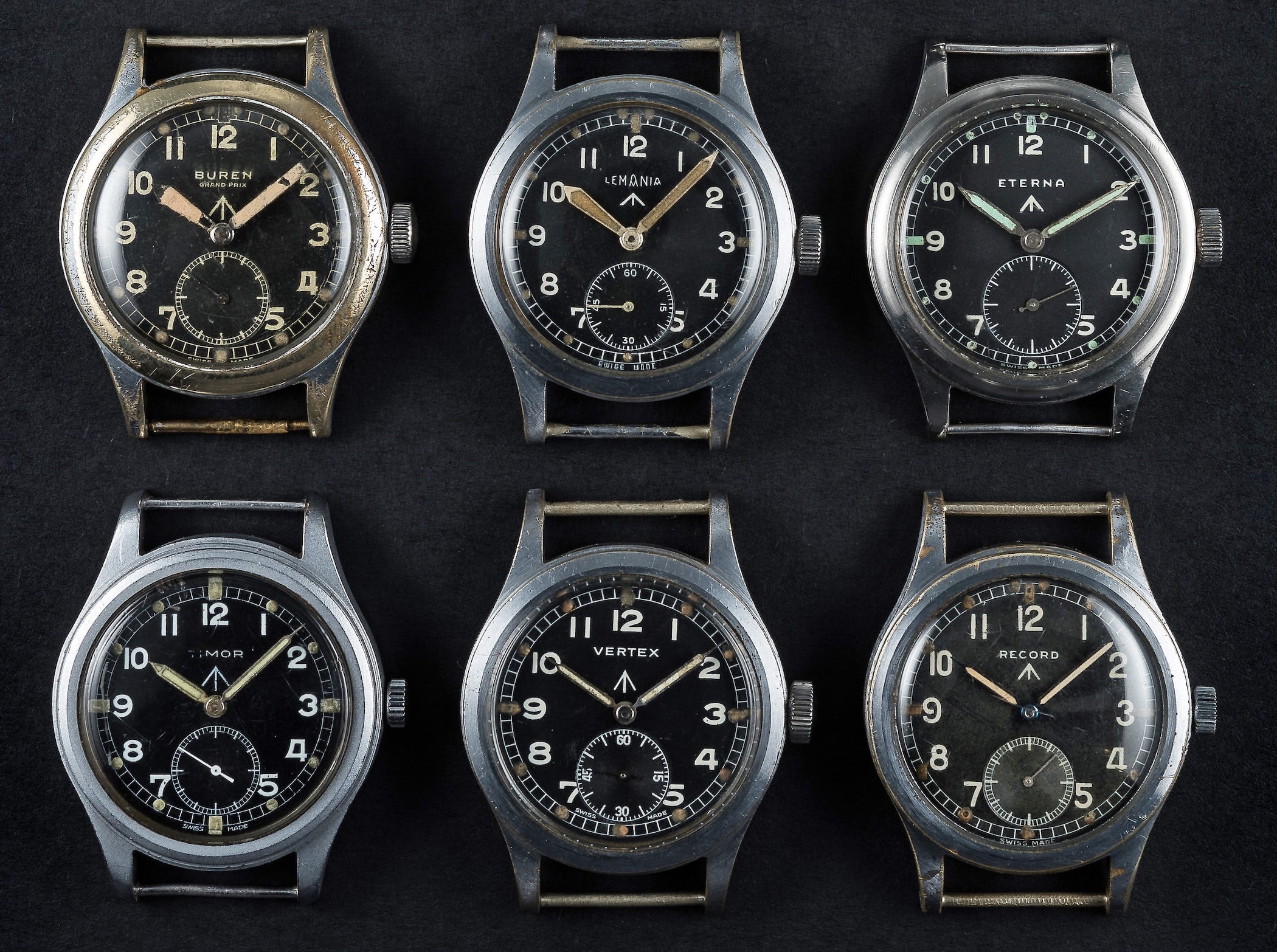
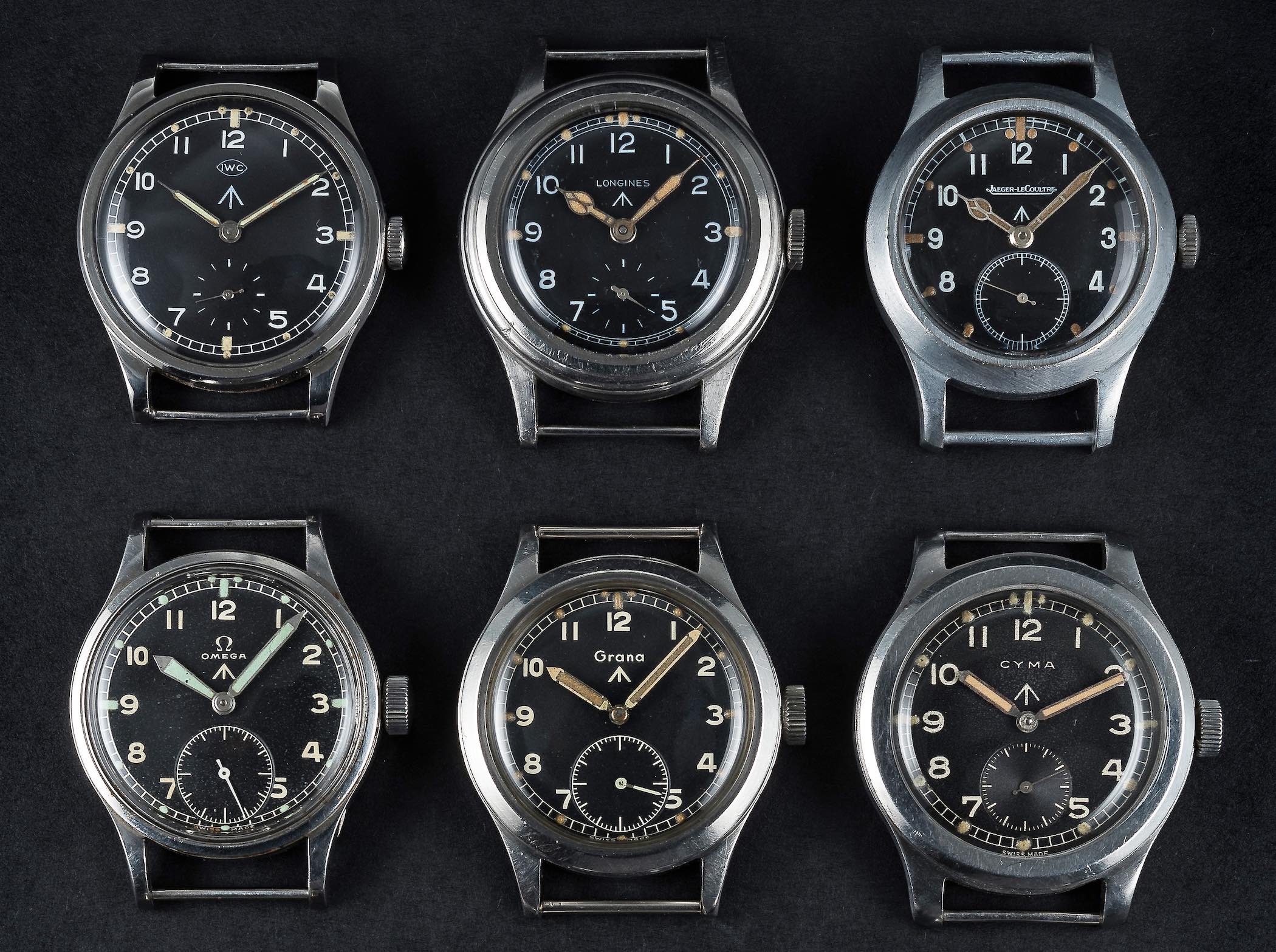
- The "Dirty Dozen": Commissioned by the British Ministry of Defence from 12 Swiss and British manufacturers (including IWC, Omega, and Longines), featuring black dials, bold Arabic numerals, sub-seconds at 6 o’clock, and the British "Broad Arrow" property mark.
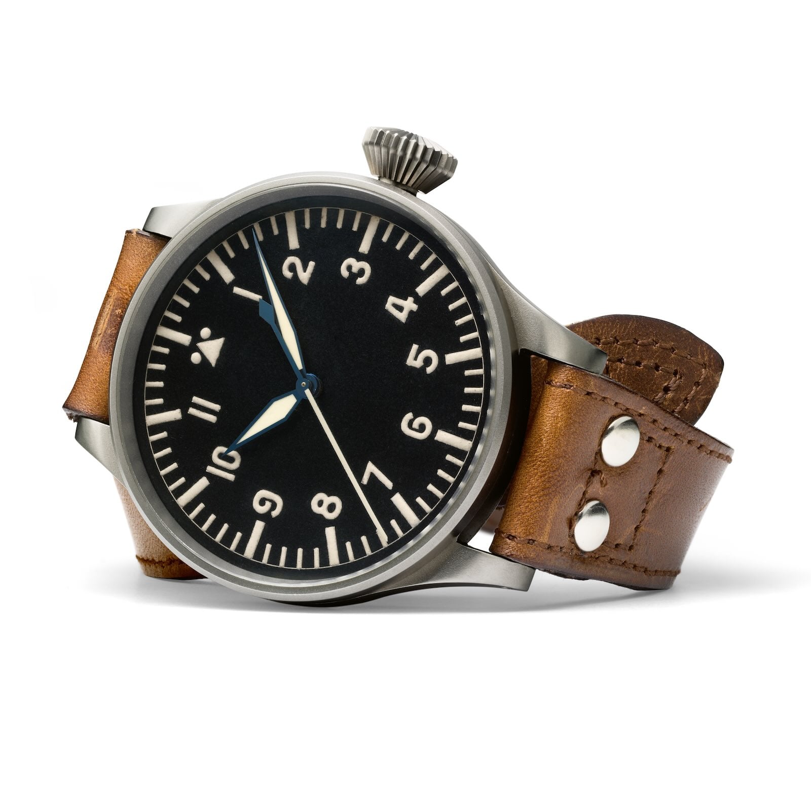
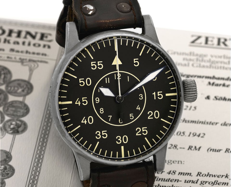
- B-Uhren Observation Watches: Commissioned by the German RLM for Luftwaffe navigators, these massive 55mm instruments featured Type A (simple Arabic numerals with a double-dot triangle at 12) and Type B (minute-centric outer ring with an inner hour circle) layouts designed for precise navigational calculations.
Official Responses & Industry Perspectives
Modern luxury manufactures and independent ateliers alike have frequently addressed the enduring appeal of historical dial designs through heritage revivals.
Curators and auction houses, such as Phillips and Christie’s, consistently report surging collector demand for historical references featuring original gilt, sector, or military layouts. Speaking on the modern fascination with vintage aesthetics, industry analysts note that contemporary collectors increasingly seek emotional resonance and historical storytelling over mere technical specifications.
Independent houses like RGM Watch Company (reproducing historic American railroad dials) and MeisterSinger (championing single-hand medieval layouts) emphasize that heritage design elements are not mere nostalgic exercises, but viable alternatives to hyper-digitized modern aesthetics.
Implications: The Modern Heritage Craze and Future Horizons
The profound appreciation for historical dial styles has shaped contemporary watchmaking. The 21st-century "heritage craze" has breathed new life into archival layouts:
- Modern brands routinely reissue military specs (such as Praesidus interpreting the A-11 or modern reinterpretations of the Dirty Dozen).
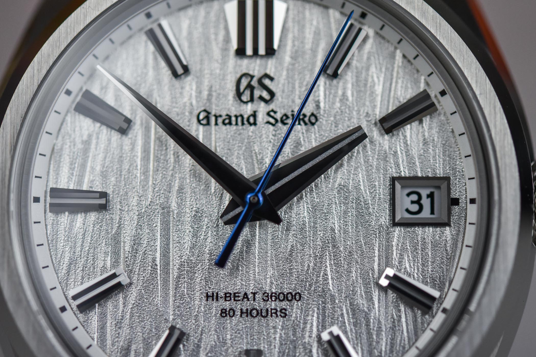
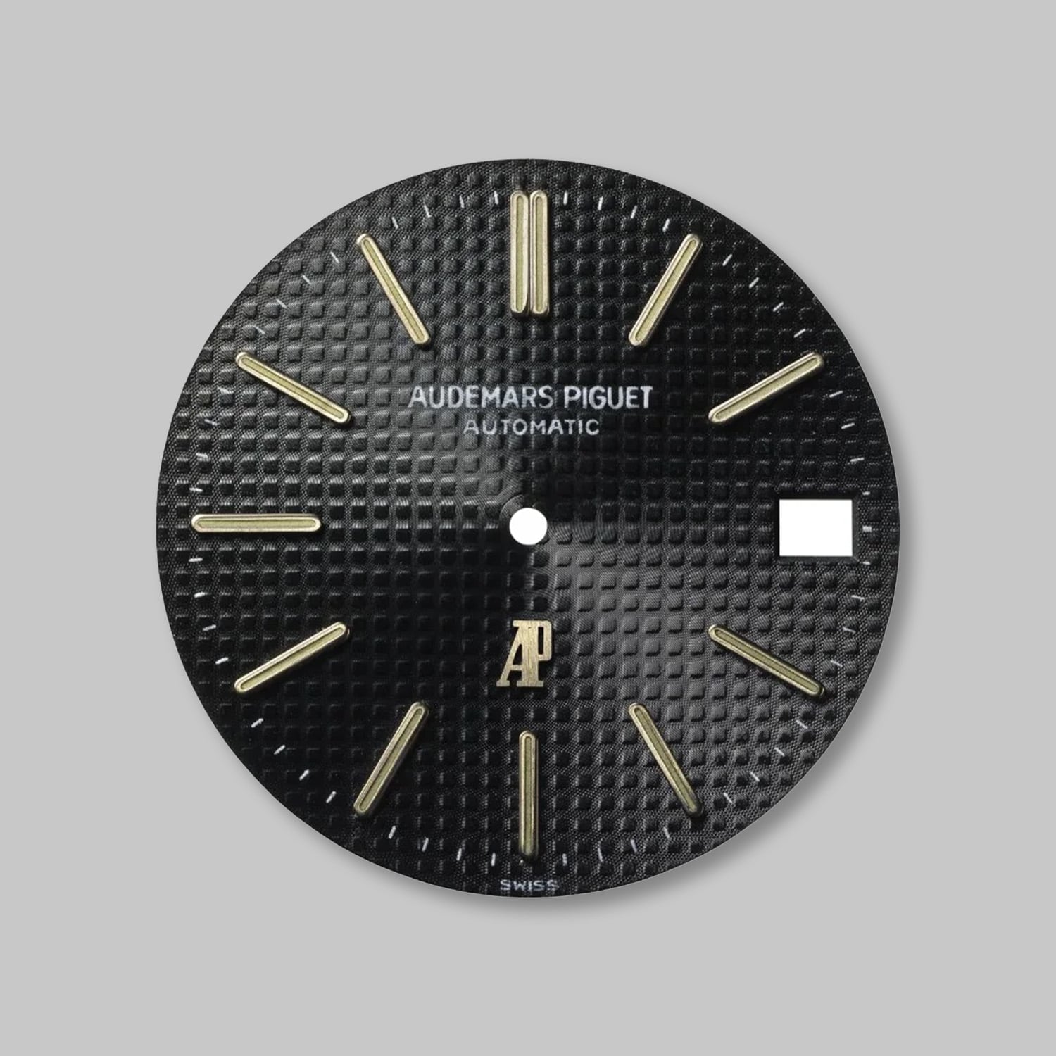
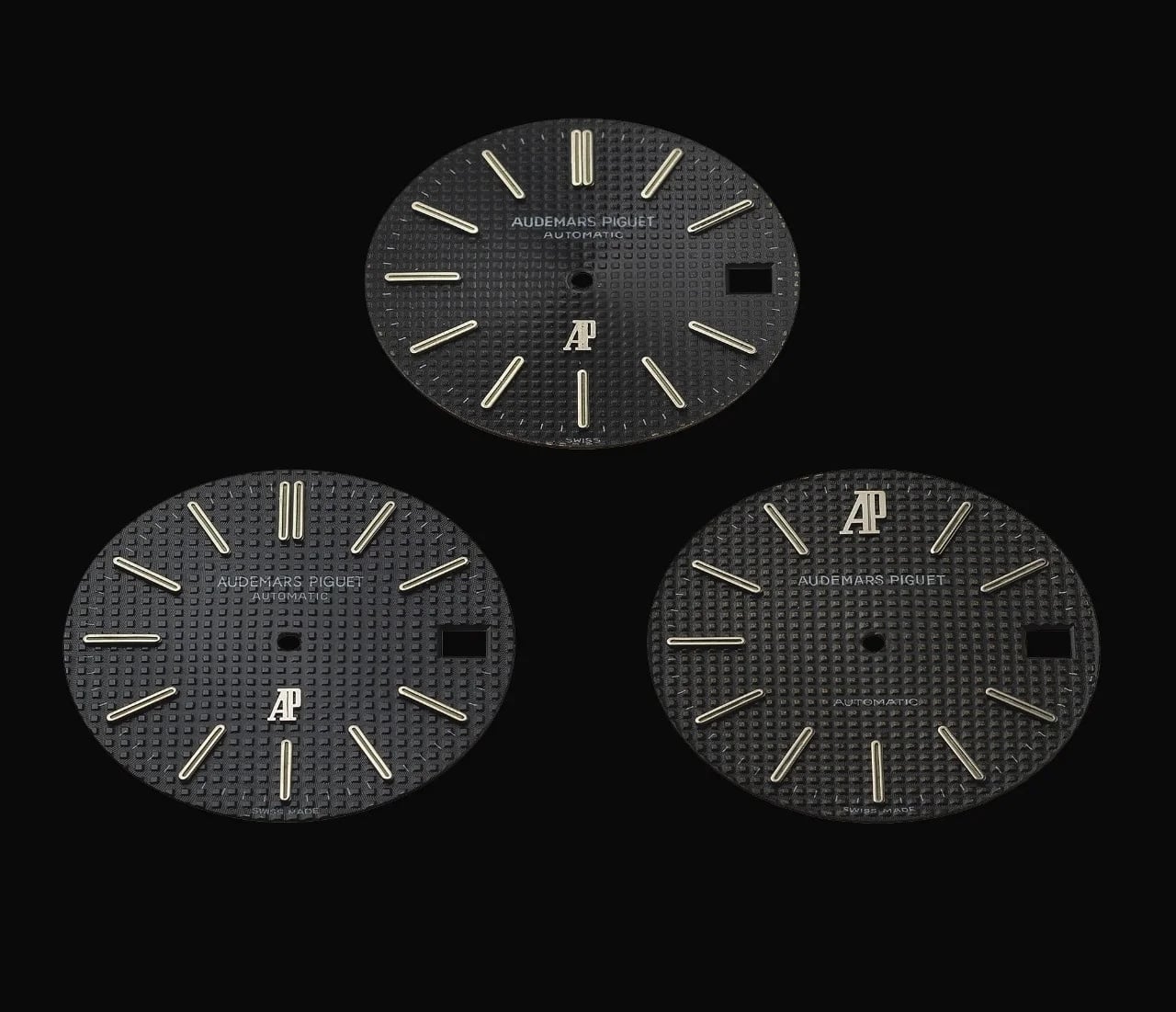
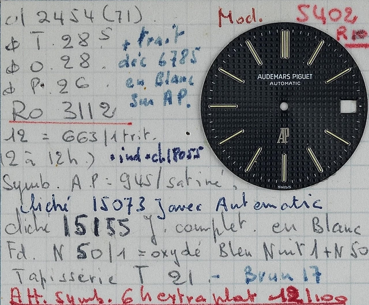
- Architectural textures like the Audemars Piguet Royal Oak’s Tapisserie (introduced by Gerald Genta in 1972) and Grand Seiko’s textured Snowflake dials demonstrate how mechanical guilloché and stamping techniques continue to push the boundaries of light play and depth.
- Modern independents like Chronoswiss have elevated the historical Regulator layout into avant-garde territory with jumping hours, retrograde minutes, and multi-layered guilloché.
As watchmaking looks to the future, the ongoing revival of historical dial styles proves that the human desire for meaningful, beautifully proportioned interfaces remains constant. While new materials and manufacturing techniques will inevitably birth unprecedented design languages, the historic blueprints established by Lépine, Breguet, Ball, and mid-century military commissioners will forever serve as the foundational grammar of horological art.